Retrospect Metrics
One of the key features of the app is the Metrics page, which is the first page you see when you log in. On this page, you can view a variety of different metrics and statistics based on your lesson learned records. You can switch between overall metrics and metrics over time, depending on what you're interested in tracking.
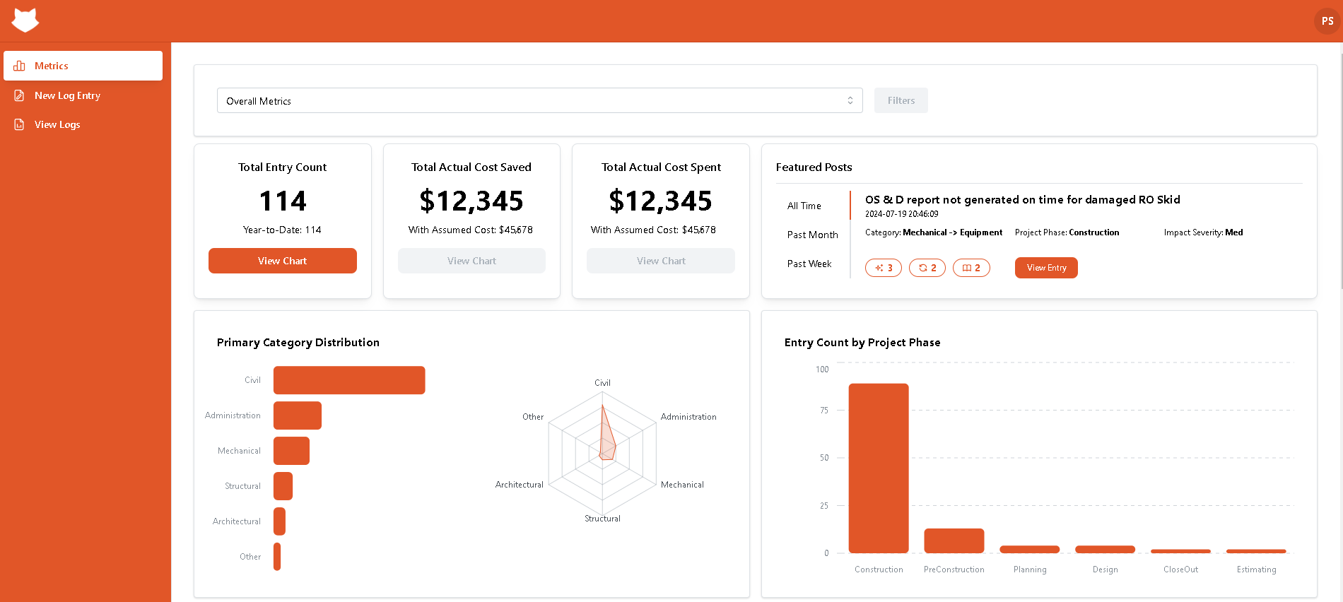
Overall Metrics
Total Entry Count
The first metric is Total Entry Count. This metric shows the total number of lessons learned and records added since the beginning of the current year. By clicking on the View Chart button, you can see a chart that represents the number of records over time, which can be helpful in identifying patterns and trends.

Total Actual Cost Saved
The second metric is Total Actual Cost Saved, which demonstrates the sum of the costs that were actually saved as a result of all the lessons learned. Additionally, the it also provides information on the amount of assumed saved costs. This can be a valuable metric for organizations that are looking to improve their bottom line and reduce costs.

Total Actual Cost Spent
The Total Actual Cost Spent metric shows the sum of the costs that were actually spent and assumed spent costs as a result of all the lessons learned. This metric can be useful for comparing the costs saved against the costs spent, and for identifying areas where further cost savings may be possible.

Featured Posts
The Featured Posts section highlights the lesson learned entry that has received the most reactions from other users. You can view the entry title, creation time, category phase, and impact severity, which can be helpful in understanding the nature and scope of the lesson learned. You can view the featured post over all time, over the past 30 days, or over the past 7 days, depending on your preference. By clicking on the View Entry button, you can jump to the detailed view page for that entry, where you can see more information about the lesson learned and any associated reactions. Overall, the Featured Posts section can be a great way to quickly learn from some of the most impactful and well-received lesson learned entries in the system.

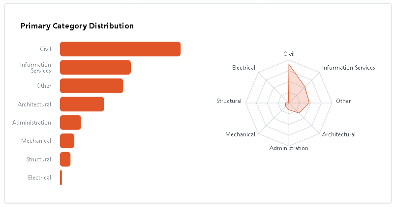
Primary Category Distribution
The Primary Category Distribution section on the Metrics page provides two charts: a bar chart and a radar chart. These charts help users to compare different categories and the number of entries that fall under each category.
The bar chart provides a visual representation of the distribution of primary categories, with each bar representing a different category and the height of the bar indicating the number of records in that category. If you hover over a category bar on the bar chart, you will see the exact number of records in that category displayed.
The radar chart, on the other hand, provides a more comprehensive view of the primary category distribution by showing the distribution across multiple dimensions or attributes. In this chart, each category is represented by a point on the chart, and the distance from the center of the chart to the point reflects the number of records in that category. The radar chart can be a helpful tool for identifying patterns and trends in the distribution of primary categories and for visualizing the relationships between different categories.
Entry Count by Project Phase
The Entry Count by Project Phase section provides a visual representation of the number of lesson learned entries at each project phase. Each phase is represented by a bar on the chart, and the height of the bar indicates the number of records in that phase. If you hover over a project phase bar, you will see the exact number of records in that phase displayed. This can be a helpful tool for identifying areas where there may be a higher or lower number of lesson learned entries, which can in turn help to identify areas where additional attention or focus may be needed.

Entry Count by Outcome
The Entry Count by Outcome section provides a bar chart that shows the number of outcomes that have been prevented, or occurred. Each outcome is represented by a bar on the chart, and the height of the bar indicates the number of records for that outcome. If you hover over an outcome bar, you will see the exact number of records for that outcome displayed. This can be a helpful tool for identifying areas where there may be a higher or lower number of outcomes, and for understanding the impact of lesson learned entries on project outcomes.

Entry Count by Impact
The Entry Count by Impact section provides a bar chart that shows the distribution of lesson learned entries across different levels of impact. Each level of impact is represented by a bar on the chart, and the height of the bar indicates the number of records for that impact level. If you hover over an impact level bar, you will see the exact number of records for that impact level displayed.

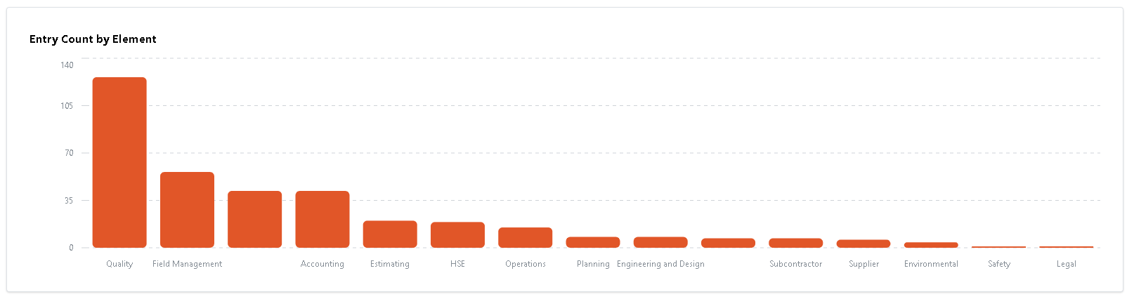
Entry Count by Element
The Entry Count by Element section on the Metrics page provides a bar chart that shows the number of lesson learned entries for each element. Elements are represented by a bar on the chart, and the height of the bar indicates the number of records for that element. If you hover over an element bar, you will see the exact number of records for that element displayed.
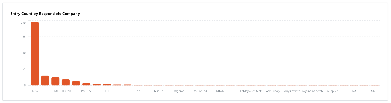
Entry Count by Responsible Company
The Entry Count by Responsible Company section provides a bar chart that shows the number of lesson learned entries for each responsible company. Each company is represented by a bar on the chart, and the height of the bar indicates the number of records for that company. If you hover over a company bar, you will see the exact number of records for that company displayed. This can be a helpful tool for understanding the overall distribution of lesson learned entries across different companies.
Metrics Over Time
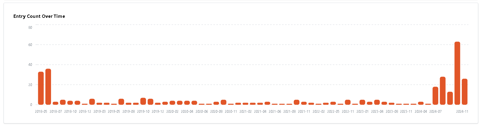
Entry Count Over Time
The Entry Count Over Time chart on the Metrics Over Time page provides a visual representation of the distribution of the total number of lesson learned entries over time. Each bar on the chart represents a month time frame, and the height of the bar indicates the number of records for that month. If you hover over a bar, you will see the exact number of records within the specific month displayed. This can be a helpful tool for identifying patterns and trends in the distribution of lesson learned entries over time, and for understanding the overall progress and performance of the organization.
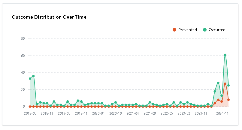
Outcome Distribution Over Time
The Outcome Distribution Over Time line chart provides a visual representation of the number of prevented and occurred outcomes within a month time frame over time. The chart shows the trend for each type of outcome over time, with markers indicating the number of records for each month. If you hover over a marker, you will see the exact number of records within the specific month displayed.
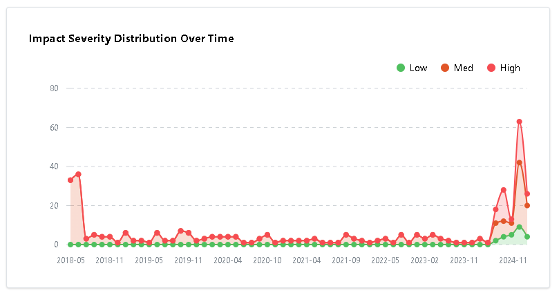
Impact Severity Distribution Over Time
The Impact Severity Distribution Over Time line chart provides a visual representation of the number of lesson learned entries that have high, medium, and low impact severity over time. The line chart shows the trend for each level of impact severity over time, with markers indicating the number of records for each month. If you hover over a marker, you will see the exact number of records with high, medium, and low impact severity within the specific month displayed. This can be a helpful tool for identifying patterns and trends in the distribution of impact severity over time.